Projects

Designing white-label Infrastructure for Private Markets

AT A GLANCE

My bets among other efforts helped us gain 90+ partners with €100M+ in assets under management (AUM)

During my time at ROYC, I made two bets that founders initially pushed back on:

  • A modular white-label design library on day one, asked for a week to prove it. I got a green light, by month three, it was a crucial foundation that saved €200K+ in costs.

  • Proposed splitting our platform into two distinct products - one for investors, another for operational partners. Founders were hesitant, I mapped the workflows, showed the UX gains, got it approved.

Project Details

Role

Lead Product Designer

Company

ROYC

Timeline

7 months

Team

Product Designer, 2 co-founders, 3 frontend engineers, CTO

Tools

Figma, Agents, Pen & Paper

€100M+ AUM

in 2 yrs

€200K+ savings

with Modular DS

90+ partners

in 2 yrs

before — after snapshot of the platform
CHALLENGE

Private markets drive wealth creation, yet analog workflows make wealth managers 70% slower

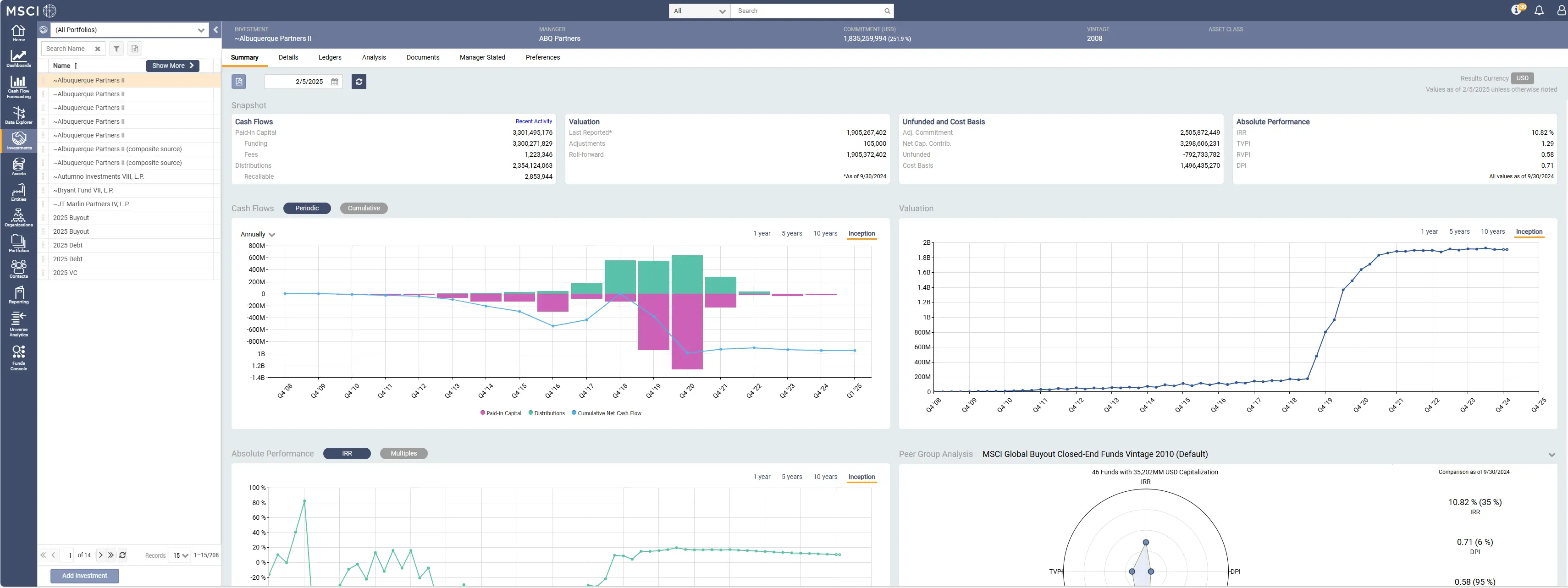
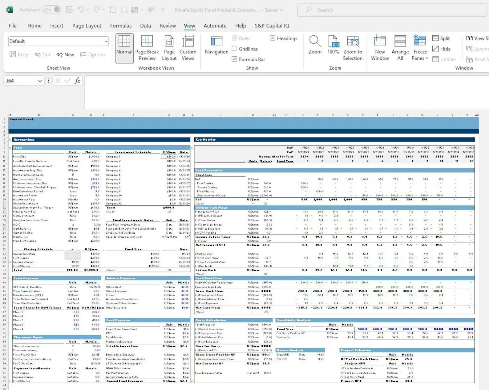
Wealth managers spend their days trapped in scattered Excel sheets and legacy terminals, manually managing data across jurisdictions. This fragmented infrastructure balloons what should be a 6-week, €200K fund launch into a 6-month, €2M legacy ordeal.

When I joined, ROYC had challenges in four critical areas:

  • Enterprise deals 🏢: The early prototype lacked streamlined workflow and visual polish losing the credibility needed to close enterprise deals.

  • Streamlined workflows⚙️: The platform tried to serve two different user persona and their needs in a single platform.

  • Scalability 📈: The founders promised scalable white-labeling, but lacked the modular design system among others to deliver it. (rebrand cleanly for Deutsche Bank, a Geneva family office, and Scandinavian wealth managers without rebuilding three times)

CHALLENGE

Private markets drive wealth creation, yet analog workflows make wealth managers 70% slower

Wealth managers spend their days trapped in scattered Excel sheets and legacy terminals, manually managing data across jurisdictions. This fragmented infrastructure balloons what should be a 6-week, €200K fund launch into a 6-month, €2M legacy ordeal.

When I joined, ROYC had challenges in four critical areas:

  • Enterprise deals 🏢: The early prototype lacked streamlined workflow and visual polish losing the credibility needed to close enterprise deals.

  • Streamlined workflows⚙️: The platform tried to serve two different user persona and their needs in a single platform.

  • Scalability 📈: The founders promised scalable white-labeling, but lacked the modular design system among others to deliver it. (rebrand cleanly for Deutsche Bank, a Geneva family office, and Scandinavian wealth managers without rebuilding three times)

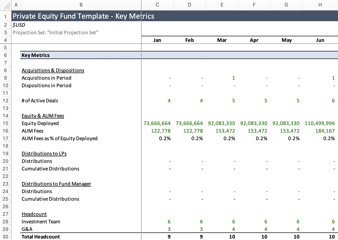
screenshots of data-heavy legacy tools used by wealth managers

SOLUTION

From Prototype to €100M+ AUM with multiple bets

Three challenges defined the entire scope of this project: closing enterprise deals with a prototype that lacked credibility, serving two fundamentally different user groups from a single platform, and delivering on a white-label scalability promise without the architecture to back it.

SOLUTION

From Prototype to €100M+ AUM with multiple bets

Three challenges defined the entire scope of this project: closing enterprise deals with a prototype that lacked credibility, serving two fundamentally different user groups from a single platform, and delivering on a white-label scalability promise without the architecture to back it.

Native mobile-web experience

Adapted dense layouts for tablet and mobile viewports. Replaced horizontal tables with swipeable card stacks, optimized touch targets, ensuring seamless user experience on the move.

Modular design system

White-label system using 80+ tokens (Mandrope typography, high-contrast palette, 8px grid) and 120+ components. Drove 80–90% code reuse, enabling 4 brand customizations in <3 months and $250K+ overhead savings.

Investor vs. Partner portal split

Two user groups with opposite priorities: investors want dashboards, operators want task lists. Split mid-project into separate platforms. Closed different customer segments. Different business models—subscription vs. SaaS.

Interactive Data Visualization

Simplified complex financial metrics (performance attribution, capital schedules) through interactive charts and clean summaries. Made dense data readable, converting raw numbers into visual stories.

Native mobile-web experience

Adapted dense layouts for tablet and mobile viewports. Replaced horizontal tables with swipeable card stacks, optimized touch targets, ensuring seamless user experience on the move.

Investor vs. Partner portal split

Two user groups with opposite priorities: investors want dashboards, operators want task lists. Split mid-project into separate platforms. Closed different customer segments. Different business models—subscription vs. SaaS.

Modular design system

White-label system using 80+ tokens (Mandrope typography, high-contrast palette, 8px grid) and 120+ components. Drove 80–90% code reuse, enabling 4 brand customizations in <3 months and $250K+ overhead savings.

Interactive Data Visualization

Simplified complex financial metrics (performance attribution, capital schedules) through interactive charts and clean summaries. Made dense data readable, converting raw numbers into visual stories.

Design that closed enterprise deals

The early prototype lacked visual credibility. Traders accustomed to Excel and legacy terminals needed to see something that felt trustworthy and purpose-built before they would engage seriously. Design became the primary sales tool.

High-fidelity prototypes shown in a prospect's brand colors made partners assume the product had been custom-built for them. A wealth simulator let bankers model projected returns across asset types and custom variables, turning abstract fund structures into interactive scenarios they could explore in a demo. Custom **data visualization** components surfaced capital schedules, asset allocation, and performance attribution as interactive charts, making dense financial data immediately readable. Together, these turned demos into closings. 5 enterprise clients signed post-redesign.

Design that closed enterprise deals

The early prototype lacked visual credibility. Traders accustomed to Excel and legacy terminals needed to see something that felt trustworthy and purpose-built before they would engage seriously. Design became the primary sales tool.

High-fidelity prototypes shown in a prospect's brand colors made partners assume the product had been custom-built for them. A wealth simulator let bankers model projected returns across asset types and custom variables, turning abstract fund structures into interactive scenarios they could explore in a demo. Custom **data visualization** components surfaced capital schedules, asset allocation, and performance attribution as interactive charts, making dense financial data immediately readable. Together, these turned demos into closings. 5 enterprise clients signed post-redesign.

One Product Became Two

One interface serving both investors and operators created cognitive overload for both groups. The priorities are opposite: investors need allocation views, performance snapshots, and capital call alerts; operators need task queues, compliance boards, and fund servicing tools. They cannot share a coherent product.

The fix was a mid-project split into two purpose-built platforms. The Investor Portal was designed around portfolio overview, allocation tracking, and investing decisions. The Partner Portal was built for compliance checklists, fund lifecycle tasks, and back-office operations. Each was tuned to its audience from the ground up. Both shipped with full mobile responsiveness — dense data grids reorganized into swipeable card stacks, hover states replaced with tap-to-expand, and actions anchored to thumb reach. The split also unlocked two distinct business models: subscription for investors, SaaS for operational partners.

One Product Became Two

One interface serving both investors and operators created cognitive overload for both groups. The priorities are opposite: investors need allocation views, performance snapshots, and capital call alerts; operators need task queues, compliance boards, and fund servicing tools. They cannot share a coherent product.

The fix was a mid-project split into two purpose-built platforms. The Investor Portal was designed around portfolio overview, allocation tracking, and investing decisions. The Partner Portal was built for compliance checklists, fund lifecycle tasks, and back-office operations. Each was tuned to its audience from the ground up. Both shipped with full mobile responsiveness — dense data grids reorganized into swipeable card stacks, hover states replaced with tap-to-expand, and actions anchored to thumb reach. The split also unlocked two distinct business models: subscription for investors, SaaS for operational partners.

Design System for a white-label scale

ROYC's core business promise — rebrand cleanly for Deutsche Bank, a Geneva family office, Scandinavian wealth managers, without rebuilding — required a foundation that could swap the visual layer without touching the interface. Without it, every new client was a rebuild.

The design system was built from scratch in parallel with feature delivery, using a 3-tier token structure (color/typography/spacing, semantic roles, component overrides) across 4 white-label brand variants, 80+ tokens, and 120+ components. A one-week trial swapping just the color system and typography earned full stakeholder buy-in. Engineering alignment was built in from the start: a dedicated month of joint component work drove 100% adoption by month 3, and Figma plugins cut batch token application from 6 hours to 15 minutes. Result: design velocity from 5 days to 2 days, inconsistencies down 60%, 4 white-labeled products shipped in under 3 months at 80-90% code reuse. $250K+ saved. 90+ partners. €100M+ AUM.

Design System for a white-label scale

ROYC's core business promise — rebrand cleanly for Deutsche Bank, a Geneva family office, Scandinavian wealth managers, without rebuilding — required a foundation that could swap the visual layer without touching the interface. Without it, every new client was a rebuild.

The design system was built from scratch in parallel with feature delivery, using a 3-tier token structure (color/typography/spacing, semantic roles, component overrides) across 4 white-label brand variants, 80+ tokens, and 120+ components. A one-week trial swapping just the color system and typography earned full stakeholder buy-in. Engineering alignment was built in from the start: a dedicated month of joint component work drove 100% adoption by month 3, and Figma plugins cut batch token application from 6 hours to 15 minutes. Result: design velocity from 5 days to 2 days, inconsistencies down 60%, 4 white-labeled products shipped in under 3 months at 80-90% code reuse. $250K+ saved. 90+ partners. €100M+ AUM.

The Solution

Design that closed enterprise deals

The early prototype lacked visual credibility. Traders accustomed to Excel and legacy terminals needed to see something that felt trustworthy and purpose-built before they would engage seriously. Design became the primary sales tool.

High-fidelity prototypes shown in a prospect's brand colors made partners assume the product had been custom-built for them. A wealth simulator let bankers model projected returns across asset types and custom variables, turning abstract fund structures into interactive scenarios they could explore in a demo. Custom **data visualization** components surfaced capital schedules, asset allocation, and performance attribution as interactive charts, making dense financial data immediately readable. Together, these turned demos into closings. 5 enterprise clients signed post-redesign.

caption

The Process

Domain Immersion First

Private markets are niche—fewer than 1,000 specialized traders globally understand workflows deeply. I couldn’t rely on week-2 user testing. Instead, I shadowed founders from Blackstone and Nordia for weeks, attended design partner sessions with family offices and wealth managers, and ran 5–6 user interviews focused on hesitations and expected workflows. By week 3 I could sketch fund lifecycles, explain why metrics matter to different personas (LP vs. GP vs. advisor), and predict where users would get confused.

Design System as Strategy

I advocated hard for a design system from day one—controversial, but essential for white-label capability. Founders wanted features, not systems. Engineers said it would slow them down. Turning point: I asked for a one-week trial, changed the color system and typography, showed the results. That gave confidence to invest. Built components in parallel with features. Within week 4, I had 30+ components in Figma. By month 3, it was non-negotiable. Engineers adopted it 100%.

Platform Split Decision

Mid-project, I realized one platform couldn’t serve two opposing user groups. Investors wanted executive-level dashboards and allocation tracking. Partners (operational staff) wanted task lists, compliance checklists, and workflow progression. I made the case through detailed workflow mapping and convinced founders to split into two focused platforms—each closing different customer segments.

AI-Native Workflow

I used AI at three critical junctures: synthesizing 5–6 user interview recordings (4 hours saved per interview), generating 80+ token names and values for 4 white-label variants (3–4 hours saved), and developing a Figma plugin that batch-applies tokens in 15 minutes instead of 6 hours. AI eliminated busywork, not creativity.

caption

Gallery

Reflections

01

Innovation needs domain fluency

ROYC succeeded not because we were first—we succeeded because we combined deep banking domain knowledge, first-principles design thinking, and the discipline to say no. Most fintechs fail by adding features for every request. Simplicity, backed by expertise, is the real differentiator.

02

High-fidelity prototypes as a sales weapon

In legacy industries, users don't know what modern software looks like until they see it. A fully interactive, branded prototype didn't just validate the UX—it became the founders' primary sales asset. Showing it in a partner's brand colors closed rooms where slide decks failed.

03

Data visualization was the hidden north star

I didn't anticipate how central visualization would become. Complex financial data—performance attribution, capital schedules, allocations—had to become stories, not spreadsheets. A picture says a thousand words became our north star.

04

Psychological safety over velocity

Constant pressure to ship faster reduced quality and morale. We succeeded not because we burned harder, but because team members felt valued and heard. Psychological safety accelerated iteration more than any sprint cadence. Respect for people isn't soft—it's a multiplier.

Great design isn't about pixel perfection or trendy interactions—it's about understanding a market, simplifying complexity, and building infrastructure for others to scale.

The traders and wealth advisors using ROYC every day aren't thinking about the design system or token structure. They're closing deals faster, reporting to their LPs more reliably, and scaling offerings that were impossible before. That's impact that matters.